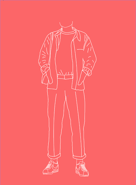
As well as an illustration I wanted to add more to make sure that people understood more about the point/the link to my essay. I am thinking about adding a small information part to the illustration this would put into better context. For example when I looked to Matt Blease and the work he did for The Sunday Times, he created funny names that linked well with the illustrations. I thought about how I could do something similar to this, I when realised that it would have to be about what magazines they read and how they act, so I decided that I would add to the information - what they read, what they wear, what they drink and what they enjoy.
I am yet to decided how many of these illustrations I will be doing, but having a series of the illustrations would be better as it would show the diversity of the sub-culture that I have highlighted within my essay.
Using illustrator I was able to trace around the person making it come to life as an illustration as I am trying to develop my own style I was undecided about weather to make it look more realistic by filling in the colour. But after a crit I got some valuable feedback and it was suggested that I leave it as a keyline illustration as it is different to a lot of other styles out there. I was also unsure about weather to include the head of the character, and again the crit help me decide that it would better to leave it out because it makes people understand that my point is more about what people wear, rather than what they look like.
After having keylined the character I then had to decide how I was going too display it, the idea was given to me from a crit that I would make the colout of the background a colour from the outfit. So below I are some screen grabs of how I experimented if seeing how I could use different colours that relate to that the character is wearing in the photograph.
I also improved the illustration by giving the drawing a heavier stoke because it would be more difficult to screen print if I made the lines too fine. I feel that this has improved the illustration as it still has that very clean look but its is easier on the eye.
Once I had finalised the design (shown above) the next stage was to actually start the screen printing process. I had a few problems when I started. First I exposed the screen backwards, but this was not a problem as it meant that I could then do some test prints to see if the design would work well using white ink. Which it did not so I had to go back to the computer and up my line weight so that the design would print a lot better. Once I had changed the design so that the line weight was heavier I was able to expose the scene again, this time I learnt from my mistakes and I did it right first time. This time when I came to print I had some more trouble, first being that my white ink was not coming though as I wanted, I put this down to that I didn't have enough medium in my paint and the second I wasn't enough pressure. So I cleaned the screen and loved of of those problems. Eventually the print came out how I intended.


No comments:
Post a Comment