Saturday, April 23, 2016

Practical - This is Graphic Design - Production Final

Th final illustration came out as planned, it is simple but effective. Dispute the trouble I had when screen printing I was able to overcome those troubles with help from peers and technicians. The only problem was that I was unable to produce more than one illustration because of the lack of screens available too me, if i had more time I would have produced around design that would concentrate on more of an minimalist character. I feel that this design links well with my essay and also is making a very serious academic essay have a lighter/funnier side to it. 

Below are some images of the final result, the only improvements I would want it to make sure that the type is more visual and to centre the design more. I did have more that came out centred but they did not have the same detail that this has, but this is the ptpblem when it comes to screen printing. 


Monday, April 11, 2016

Practical - This is Graphic Design - Development & Production

To make my illustration be more original, I didn't want to take too much inspiration from other peoples work I wanted too make the illustration my own style. As I am not very good at drawing I didn't want to sketch out and then scan in a bad drawing to create the illustration, so I decided that I would use a photo that I already had to then create an illustration from. 

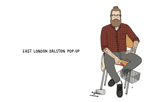
As well as an illustration I wanted to add more to make sure that people understood more about the point/the link to my essay. I am thinking about adding a small information part to the illustration this would put into better context. For example when I looked to Matt Blease and the work he did for The Sunday Times, he created funny names that linked well with the illustrations. I thought about how I could do something similar to this, I when realised that it would have to be about what magazines they read and how they act, so I decided that I would add to the information - what they read, what they wear, what they drink and what they enjoy. 

I am yet to decided how many of these illustrations I will be doing, but having a series of the illustrations would be better as it would show the diversity of the sub-culture that I have highlighted within my essay. 

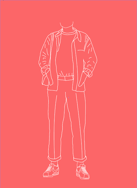
Using illustrator I was able to trace around the person making it come to life as an illustration as I am trying to develop my own style I was undecided about weather to make it look more realistic by filling in the colour. But after a crit I got some valuable feedback and it was suggested that I leave it as a keyline illustration as it is different to a lot of other styles out there. I was also unsure about weather to include the head of the character, and again the crit help me decide that it would better to leave it out because it makes people understand that my point is more about what people wear, rather than what they look like.


After having keylined the character I then had to decide how I was going too display it, the idea was given to me from a crit that I would make the colout of the background a colour from the outfit. So below I are some screen grabs of how I experimented if seeing how I could use different colours that relate to that the character is wearing in the photograph.

I also improved the illustration by giving the drawing a heavier stoke because it would be more difficult to screen print if I made the lines too fine. I feel that this has improved the illustration as it still has that very clean look but its is easier on the eye. 


Once I had finalised the design (shown above) the next stage was to actually start the screen printing process. I had a few problems when I started. First I exposed the screen backwards, but this was not a problem as it meant that I could then do some test prints to see if the design would work well using white ink. Which it did not so I had to go back to the computer and up my line weight so that the design would print a lot better. Once I had changed the design so that the line weight was heavier I was able to expose the scene again, this time I learnt from my mistakes and I did it right first time. This time when I came to print I had some more trouble, first being that my white ink was not coming though as I wanted, I put this down to that I didn't have enough medium in my paint and the second I wasn't enough pressure. So I cleaned the screen and loved of of those problems. Eventually the print came out how I intended. 


Sunday, April 3, 2016

Practical - This is Graphic Design - Research

In my essay I tried to explain how print media has evolved over the years and how certain groups of people are getting involved in different ways. I touched on the subject of why do people read certain magazines and has magazine culture become a new sub-culture much like how there are groups of people that associate themselves with other people interested in clothe brands or a certain music genre. I moved this point on to talking about stereotypes and wether people who read certain magazines behaved in a certain way for example do they wear similar clothes and do similar things etc. 

I am researching into how I will produce a practical side to my COP module. For example, artists and designers that have produced work so a similar nature, inspiration of work that will  help me to produce my work and also methods of traditional printing so that I can decide what will be the best route to take. 

Matt Blease - 

His illustration style is influenced by his graphic design background, communicating ideas in a playful and direct way. His distinctive style is recognisable in its wit and topical observations. His work can currently be seen in his weekly spot in The Guardian’s G2. 

What I found most interesting which relates well to the research topic is that he was commissioned to create portraits of “Style Tribes” for The Sunday Times Style Magazine, Kinfolk Man was a recognisable stereotype, complete with sandals, vintage cardie and a tote bag full of (presumably organic) vegetables. The illustrations focus on the way the person looks and what they are wearing, helping people to understand when someone is categorised by a name like "hipster". 


As well as his work that he was commissioned to create for The Sunday Times, I looked at his other illustrations. I noticed that how he liked to use tongue and cheek to get people to understand certain social matters and other day to day problems that we might meet. 


Kickposters -

Dan Freebairn is a illustrator/Designer that specialises in sneaker/streetwear culture illustrations. He produces illustrations of sneakers and people they are very popular among the street wear scene, as the style of his work is very clean and shows off the beaut of sneakers and other similar subjects. 


Screen Printing - 

For a detailed design this would be perfect, you are able to come up with as many colour layers as you want, but the more layers the more complicated it gets but this allows you to get a very good quality print, the process is also very straight forward and makes it very easy to print lots of outcomes rather than just one print.

Having not done any screen printing before, I feel that experimenting with the method is the best way for me to go forward win this brief. As I will be able too see how effective the process is and if the design does not work out it is not difficult to clean the screen and start again, although it can take time waiting for screens to dry etc. 

After having researched into screen printing and seeing how it will influence my design I have understood the I will have to make sure that the design is no more than 4 colour layers,  as I will be difficult enough lining up each layer, so by having more it will make it more difficult to print and get a good result every time. At this point I am un sure of how I my illustration style will be be so I have to make sure that when I am designing not to make the design over complicated. 


I felt that other printing methods such as lino-cut and mono printing, would not get me the result and accuracy that I require for this brief. The illustration needs to be crisp as it will be to some what detailed image of a person, so I feel that this would be the best way to achieve this.